
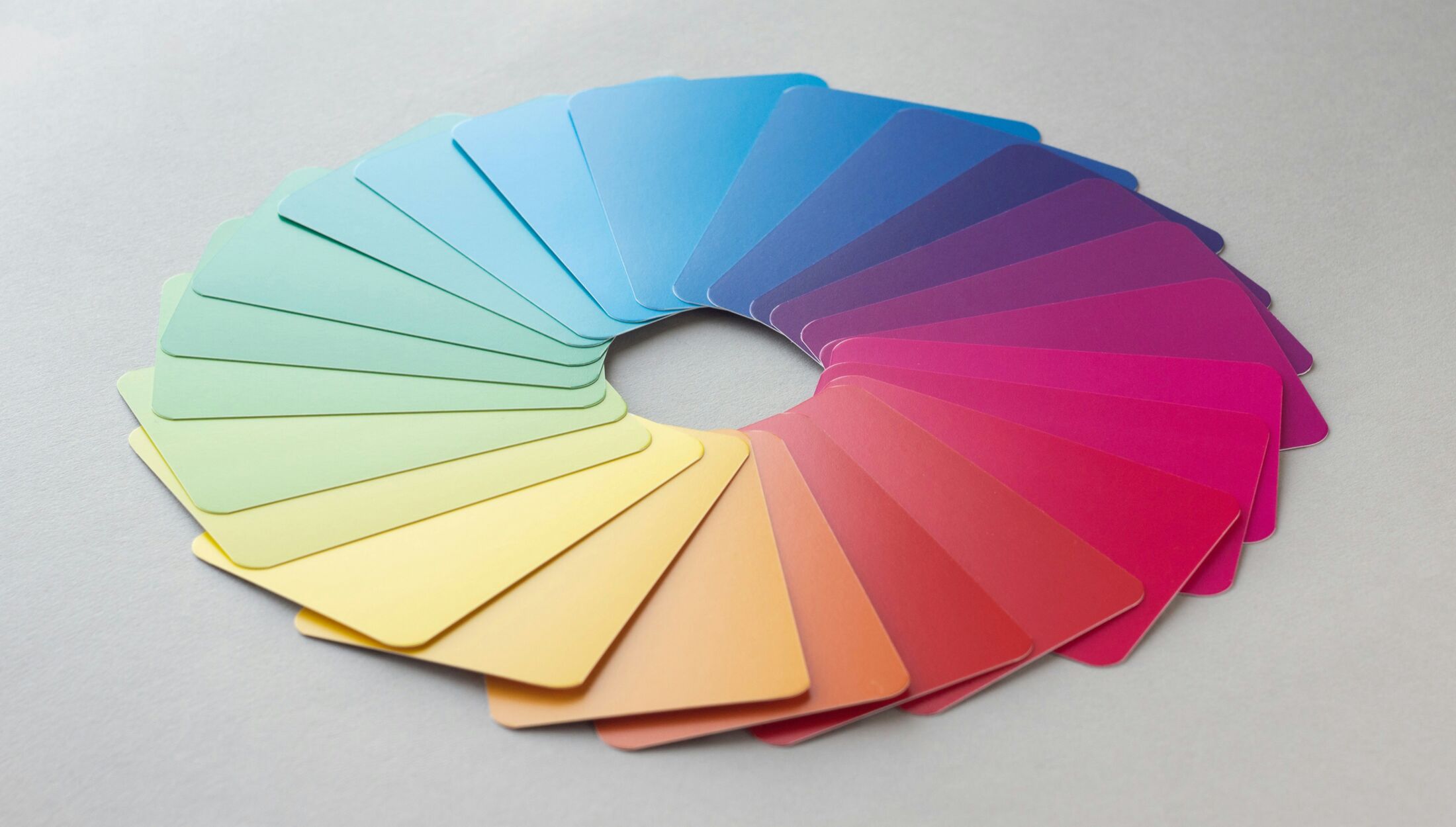
Color is the most personal element of any fabric design. It sets the mood of a garment, defines a brand identity, and ultimately determines whether a collection resonates with the end customer. Yet for clothing designers who rely on custom fabric printing, color accuracy remains one of the most persistent sources of frustration — and one of the most preventable.
The disconnect between what you see on your screen and what arrives as printed fabric is not random. It follows predictable patterns rooted in the physics of light, the chemistry of ink, and the behavior of different fiber types under dye. At NBPrintex, we've built our digital fabric printing service around helping designers navigate these variables — and the more our clients understand the factors at play, the better the results we achieve together.
This guide breaks down the key variables that influence color accuracy in custom fabric printing, and gives you practical steps to take from the moment you open your design software to the moment you approve a final print run.
The first step toward better color outcomes is understanding a fundamental truth about digital fabric printing: absolute color identity between screen and fabric is physically impossible. This is not a limitation of any particular printer or workflow — it is a consequence of how color works.
Your monitor creates color by emitting light. It combines red, green, and blue channels — the RGB color model — to produce images that can display millions of vivid hues. Fabric printing, on the other hand, is a subtractive process. Inks absorb certain wavelengths of light and reflect others back to the eye. No matter how precise the machinery, this fundamental difference in how color is generated means that some of the most luminous colors achievable on screen simply have no equivalent in physical dye.
The color gamut of a typical monitor — the full range of colors it can display — is considerably broader than what printing inks can reproduce on fabric. Neon greens, electric blues, and highly saturated corals are particularly prone to appearing flatter in print than they do on screen. Knowing this in advance allows you to make informed decisions during the design phase rather than encountering surprises at delivery.
The goal of professional custom fabric printing is not a perfect match — it is a faithful and consistent translation of your design into its best possible physical form.
Behind every successful digital fabric printing workflow is a system of color management tools that bridge the gap between design software, printing equipment, and the specific fabric being printed on. The most important of these tools is the ICC profile.
An ICC profile is a calibration file that defines how a particular device — a monitor, a printer, a scanner — interprets and reproduces color. When a printer uses an ICC profile tailored to a specific combination of ink type, fabric substrate, and machine settings, it can translate the color values in your design file into the precise ink output needed to get as close as possible to your intended result.
Think of an ICC profile not as a guarantee of perfect color, but as a highly accurate interpreter. Without it, the printing system is making educated guesses about how to render your colors. With it, those decisions are based on measured, real-world data from the exact printing conditions being used.
For clothing designers working with a custom fabric printing partner, this means several things. Your print partner should maintain fabric-specific ICC profiles for every material in their range. A profile calibrated for cotton will not produce accurate results when applied to polyester satin, because the two fabrics interact with ink in fundamentally different ways. Your design software (such as Adobe Photoshop or Illustrator) can use these profiles for soft proofing — a feature that simulates on your screen how your design will look after printing on a specific fabric. This is one of the most valuable pre-production tools available to designers. When submitting files, working in a defined color space — rather than leaving color settings unmanaged — gives your print partner the information they need to honor your color intent as accurately as possible.
One of the most underestimated variables in custom fabric printing is the fabric itself. Designers often focus heavily on design preparation but overlook the fact that the same artwork will produce noticeably different color results depending on the fiber content, weave, surface finish, and pre-treatment of the fabric it is printed on.
Natural fibers are inherently absorbent. When reactive dye inks are applied during digital fabric printing, the dye is drawn into the fiber structure and forms a chemical bond, becoming a permanent part of the fabric. The result is exceptional color fastness and a soft hand feel. However, because the ink is absorbed into and diffused through the fibers rather than sitting on the surface, colors tend to appear somewhat softer and more muted than they do on screen. Fine details may show slightly softer edges, and highly saturated hues may be toned down.
This is not a flaw — it is an inherent characteristic of natural textiles, and for many fashion applications it is precisely what is desired. The earthy, organic color palette that cotton and linen naturally produce aligns perfectly with lifestyle, heritage, and artisanal aesthetics. Silk, being a fine protein fiber, absorbs dye with exceptional depth and produces luminous, rich colors — though it requires its own ink chemistry for best results.
Polyester behaves in a completely different way under digital fabric printing. As a hydrophobic, non-absorbent fiber, polyester cannot accept water-based reactive dyes. Instead, it is printed using sublimation inks, where the dye is converted into a gas under heat and pressure and permanently bonds directly with the polymer structure of the fiber. Because the dye integrates into the fiber at a molecular level — rather than spreading through an absorbent structure — colors on polyester appear significantly more saturated, vivid, and high-contrast.
For activewear, sportswear, swimwear, and high-impact graphic prints, polyester's ability to hold intensely vivid color makes it the preferred choice. Designers targeting bright, bold colorways should bear in mind that the visual intensity achievable on polyester via sublimation printing will likely exceed what is possible on a natural fiber substrate.
Fabric blends present their own color management considerations. A cotton-polyester blend, for example, contains two fiber types that respond to ink in entirely different ways. Achieving consistent color across both fiber types requires either pigment inks — which sit on the surface of all fiber types rather than penetrating them — or a carefully managed combination of dye systems. Generally, blends with a high proportion of natural fiber (70% or above) can be printed using reactive ink systems with good results, while those with higher synthetic content require a different approach. When placing a custom fabric printing order for a blended substrate, always check with your printing partner about the specific ink system being used and its implications for your color palette.
The decisions made in your design software have a direct and significant impact on the color quality of the final printed fabric. The following practices will help you get the most out of your custom fabric printing order.
An uncalibrated monitor is one of the most common and least recognized sources of color problems in fabric printing. If your screen is displaying colors inaccurately, every decision you make about your design's color — every hue, saturation, and tonal adjustment — is based on false information. Regular monitor calibration using a hardware colorimeter brings your display in line with established color standards and gives you a reliable foundation to work from. Even a modest calibration tool represents a worthwhile investment for any designer who regularly orders custom printed fabrics.
Many designers work in RGB throughout the design process — which is natural, since screens display in RGB and design tools often default to it. However, printing systems work in CMYK or ink-specific color spaces. When RGB files are sent to a printer without any color management in place, the conversion to print color values happens automatically — and not always in the way the designer would choose.
For the most predictable results, there are two solid approaches. You can design in a well-defined RGB working space (such as Adobe RGB, which has a broad gamut suited to textile work) and use soft proofing to preview how your colors will translate before submitting your file. Alternatively, you can work in CMYK from the start, which removes the conversion step entirely and gives you direct control over the printed color values. Whichever approach you take, consistency is key — mixing unmanaged and managed color in the same file is a common source of unexpected shifts.
When color precision is critical — for example, when matching brand colors or working within a specific seasonal palette — referencing standardized color systems gives both designer and printer a shared target to aim for. Rather than describing a color as "warm terracotta" or "dusty sage," providing a specific standardized color reference removes ambiguity from the process and allows your print partner to confirm color accuracy against a measurable standard.
File quality matters in digital fabric printing. At NBPrintex, we recommend uploading files at a minimum of 150 DPI to ensure print clarity, and we accept JPG, PNG, TIF, and PSD formats. Lossless formats preserve color data most reliably, and keeping your file under 50MB ensures smooth uploading to our platform. If your design includes transparency — important for patterns with irregular edges or layered motifs — ensure the file format supports it correctly before submission.
No amount of screen-based preparation fully replaces the experience of holding the printed fabric in your hands. A physical test swatch — a sample of your design printed on your chosen fabric — is the definitive tool for assessing color accuracy in custom fabric printing before committing to a full production run.
NBPrintex offers free sampling so you can evaluate print and fabric quality before placing a full order — you only cover the shipping cost. We also offer a swatch pack featuring around 30 of our most popular fabrics, which is a practical starting point if you are still deciding on the right substrate for your collection.
When evaluating a swatch, there are a few important considerations. First, always assess the color under multiple light sources. A color that reads correctly under natural daylight may appear quite different under warm indoor or artificial retail lighting — a phenomenon known as metamerism. Second, consider the fabric in motion and from different angles, since the way a surface texture and weave interact with light affects how color is perceived at a distance versus up close. Finally, allow the swatch to go through a wash cycle before approval if the garments will be laundered, as some color shift can occur post-wash depending on the ink system and fabric type.
For businesses that work with repeat patterns or print across multiple fabric types, keeping an approved swatch archive is an excellent practice. These physical references serve as benchmarks for future orders, giving you a consistent standard to compare against and communicate to your print partner.
At NBPrintex, we print on one of the widest fabric ranges available through any online custom fabric printing service — including cotton, silk, linen, polyester, viscose, blended fabrics, knitting, mesh, lace, and more. Each fabric type behaves differently under ink, which is why we encourage clients to treat the fabric choice as an integral part of the color decision, not an afterthought.
If you are unsure which fabric will best serve your design's color intent, our team is available to advise. We can also help review and adjust your artwork to ensure it is print-ready — not by redesigning it, but by making the technical refinements that translate your creative vision as faithfully as possible into printed fabric. And because even the same color looks different on different substrates, we are happy to help you produce a color map on your specific fabric of choice, so you have a reliable reference before scaling up your order.
Color accuracy in custom fabric printing is a shared process, and the more clearly you communicate your expectations, the better equipped we are to meet them.
Before placing your next custom fabric printing order, run through the following:
Is your monitor calibrated? If not, your color judgments are based on inaccurate visual information.
Have you chosen a defined color space for your file, and does your design software have color management turned on?
Have you soft-proofed your design against a fabric-specific ICC profile to preview expected color shifts?
Have you considered the implications of your chosen fabric on color output — particularly if switching between natural and synthetic substrates?
Have you provided standardized color references for any business-critical or brand-matched colors?
Is your file at the correct resolution (minimum 150 DPI) and saved in an accepted format (JPG, PNG, TIF, or PSD)?
Have you ordered a free sample swatch before committing to a full production run?
Getting color right in digital fabric printing is not something that happens automatically, and it is not something that falls entirely on the printing partner. It is a shared responsibility — a collaboration between the designer who understands the creative intent and the print facility that understands the material and technical constraints.
When designers understand the fundamentals — the limits of color gamut translation, the behavior of different fabrics under ink, the role of ICC profiles and monitor calibration, and the value of physical proofing — they are equipped to make better creative decisions and to communicate more clearly with their print partner. The result is fewer surprises, less waste, and printed fabrics that represent the design with the precision and vibrancy it deserves.
If you have questions about preparing your files for the best possible color output, or want guidance on choosing the right fabric for your next collection, the NBPrintex team is here to help. Reach us at info@nbprintex.com or through the support section on our website.
Image credit: Andy Brown on Unsplash